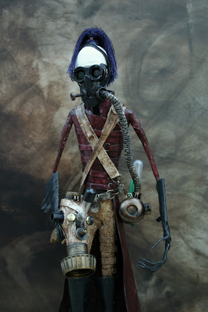
It's been nearly a year now since I actively started using this blog and promoting my work online (with the intent of selling). Its been an interesting process. I tried a few online galleries to get going; Deviant art proved great for getting feedback and a way of drawing people to the blog. It was interesting exploring how people were directed here, and I was amazed how often I found my work promoted on other sites, always respectfully and with links here.
Two weeks ago I started a facebook page called The Professor's Steampunk Emporium. I feel the name Impsandthings doesn't really reflect the steampunk work. I found many steampunk sites on facebook and 'liked' them and posted links to my work. Again an amazingly quick response and 50 'likes' already plus a lot of extra blog traffic and more followers here.Thankyou to those of you who come back again and again and add comments, it's great to get feedback and know I'm not working in a vacuum
All this has made me realise the need for better quality photos of my work. I saw on Tom Banwell's blog (a really talented maker of steampunk masks) some time last year the advantage of quality photos to enhance the work.
My aim is to create some sets for some of my pieces, maybe add smoke and good lighting but to get the ball rolling I took some quick pics with a arker painted background. White is not good for such darkly coloured sculptures. So far this is just a piece of mdf with sponged browns and black acrylic but already I can see the improvement.
Small Scottish watercolours
-
This very short blog post is the first from Scotland - so good that it
shows a few images of a couple of watercolours of local buildings - the old
sho...
4 hours ago


